
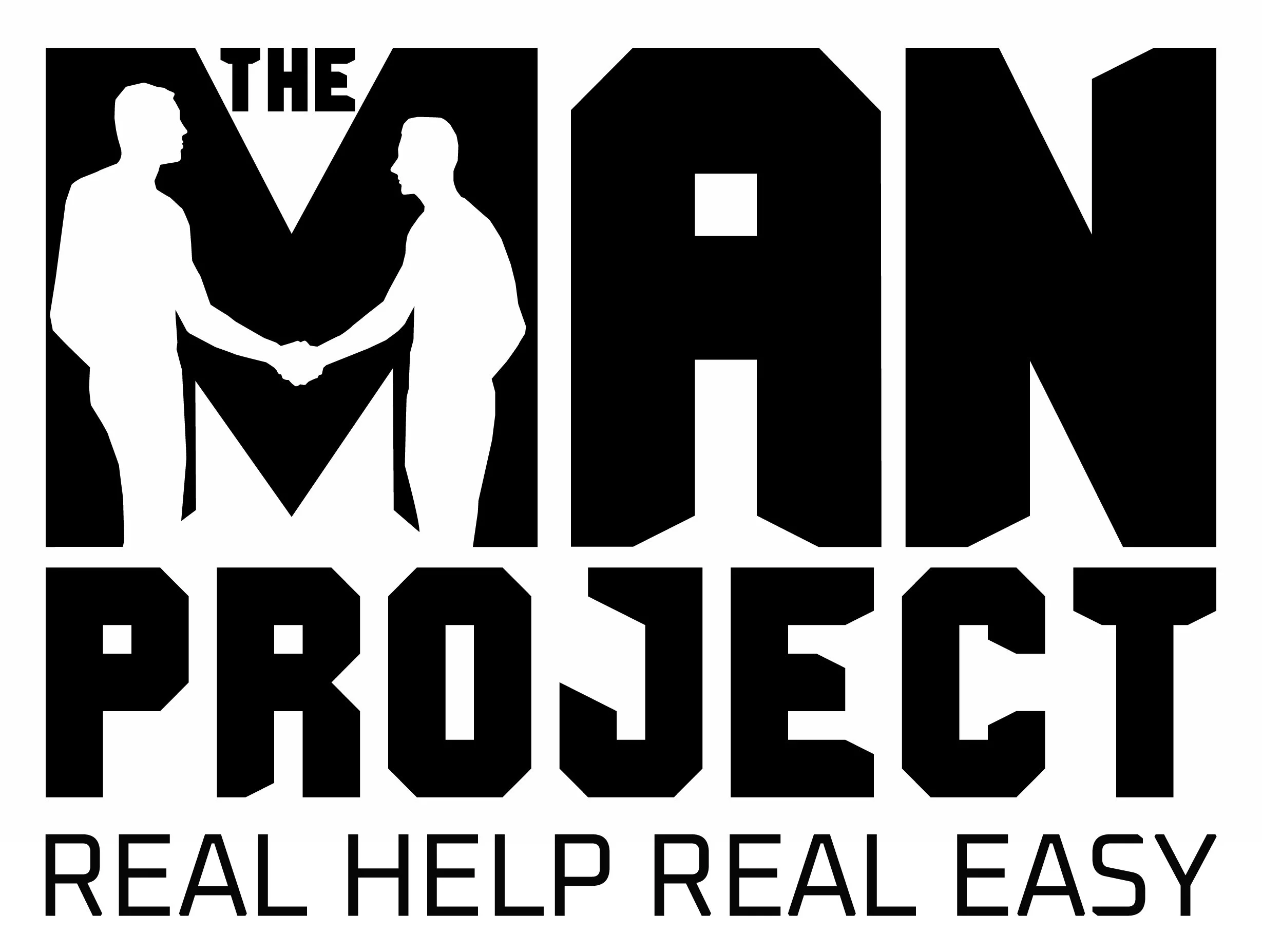
Master Version with tagline
(i) negative version: to be used on light tinted or light photographic backgrounds.
The logo for 'The MAN Project' has been carefully crafted to be highly visual, easily recognizable, and carry substantial visual weight. It is designed with simplicity in mind, allowing clients to recall it even after a quick glance.
The logo is presented in a vertical stack format, utilizing three lines. This layout maximizes the use of valuable space and creates a visually appealing composition. The uppercase text used in the logo exudes a strong sense of authority and confidence, capturing attention and commanding respect.
The tagline of the logo is meticulously aligned with the name, creating a natural sense of harmony and cohesion. This alignment ensures that clients can easily associate the tagline with the organization, reinforcing the core message of 'The MAN Project.'
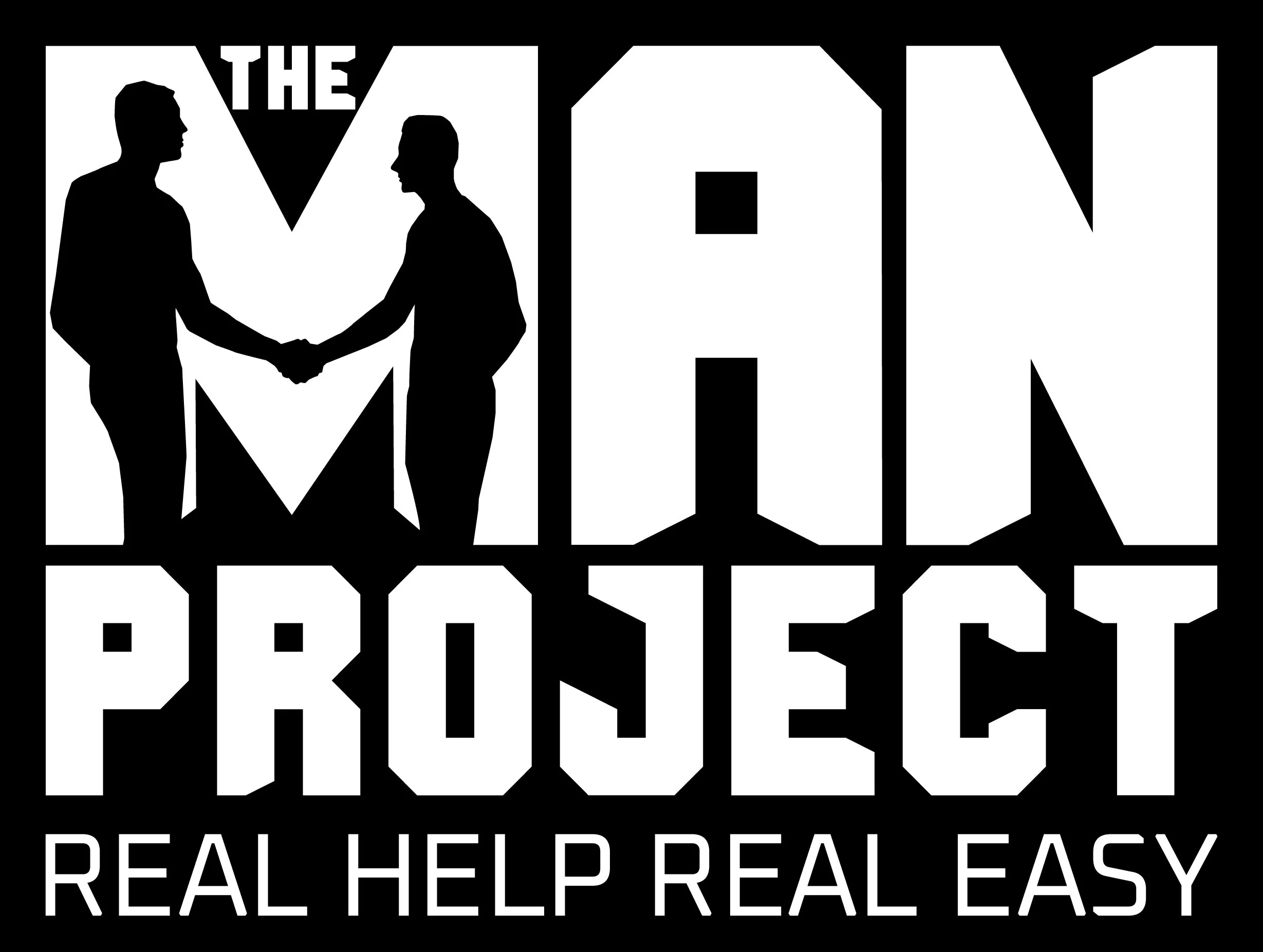
Master Version with tagline
(ii) positive version: to be used on dark tinted or dark photographic backgrounds.
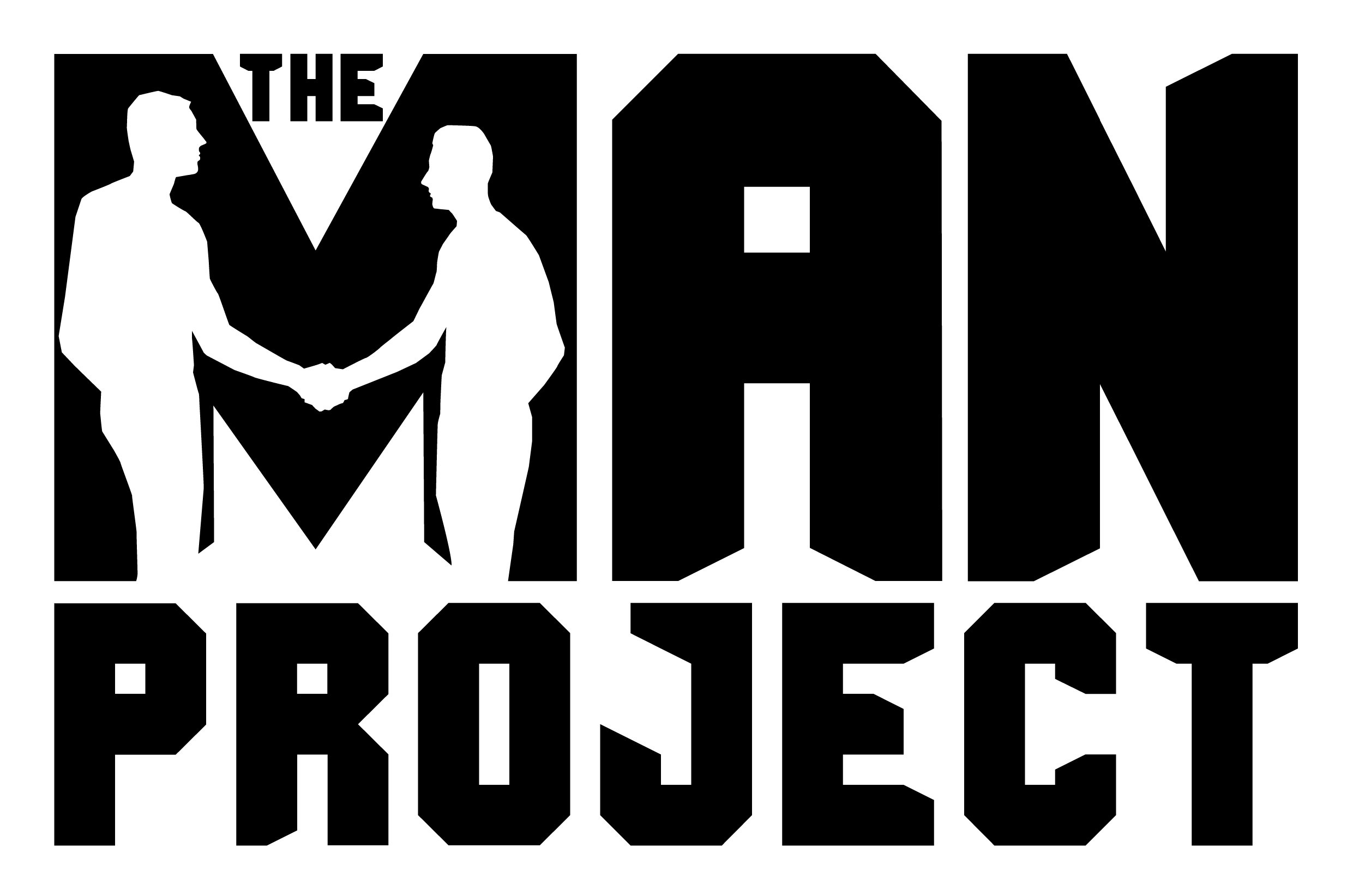
Master Version with tagline
(i) negative version: to be used on light tinted or light photographic backgrounds.
Master Version with tagline
(ii) positive version: to be used on dark tinted or dark photographic backgrounds.
Creating a logo that effectively reflects the essence of 'The MAN Project' while resonating with a diverse male audience requires careful consideration of tone, perception, and design elements. It is crucial to avoid cliché and therapeutic imagery, instead opting for an edgy, masculine, and positive aesthetic that aligns with the innovative and disruptive nature of the organization. The logo should evoke trust, recognition, and acceptance while embracing an ethically diverse male audience of all ages and backgrounds.
The logo for 'The MAN Project' exudes strength, confidence, and inclusivity. It features a bold and dynamic typography treatment, with a modern and sleek font that exudes a contemporary vibe. The typography is custom-designed, reflecting the unique and innovative nature of the organization.

Master Version no tagline
(ii) positive version: to be used on dark tinted or dark photographic backgrounds.
By employing a classic style, the logo is designed to stand the test of time. It exudes a timeless quality that will remain relevant and impactful for years to come. This classic aesthetic ensures that the logo maintains its appeal and resonance as 'The MAN Project' continues to grow and evolve.
Legibility is a key consideration in the logo design, making it easy to read in any situation and appealing to a wide range of potential clients. Whether displayed on a small website icon or on a large billboard, the logo maintains its sharpness and remains easily recognizable.
In summary, the logo for 'The MAN Project' is highly visual, easily recognizable, and carries substantial visual weight. With its vertical stack format, authoritative typography, harmonious alignment, excellent legibility, scalability, and classic style, the logo embodies the essence of the organization while ensuring a strong and lasting impression on clients.
Master Version no tagline
(ii) negative version: to be used on dark tinted or dark photographic backgrounds.
Icon
(i) positive version
The logo design incorporates a symbolic icon that embodies the spirit of 'The MAN Project.' This icon is clean and minimalistic, representing unity, support, and progress. Symbolizing the connection and shared experiences of men within the project, the icon also incorporates subtle elements that hint at growth, resilience, and empowerment, reinforcing the positive message of the organization.
Icon
(i) negative version
Negative version on simple background
Positive version on simple background
Negative version on simple background
Positive version on simple background
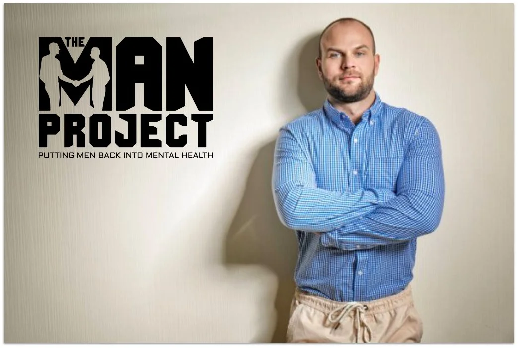
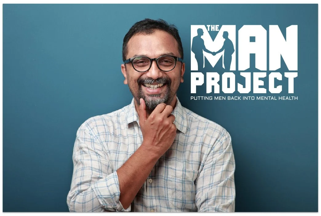
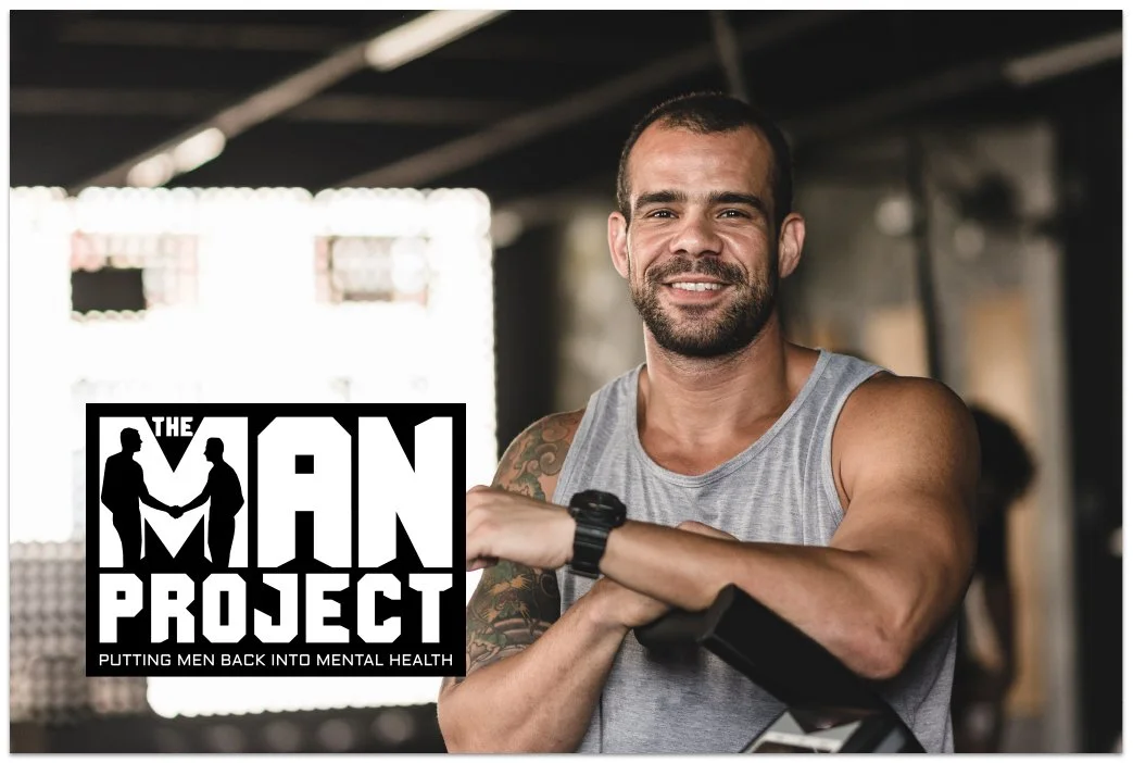
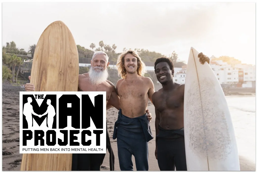
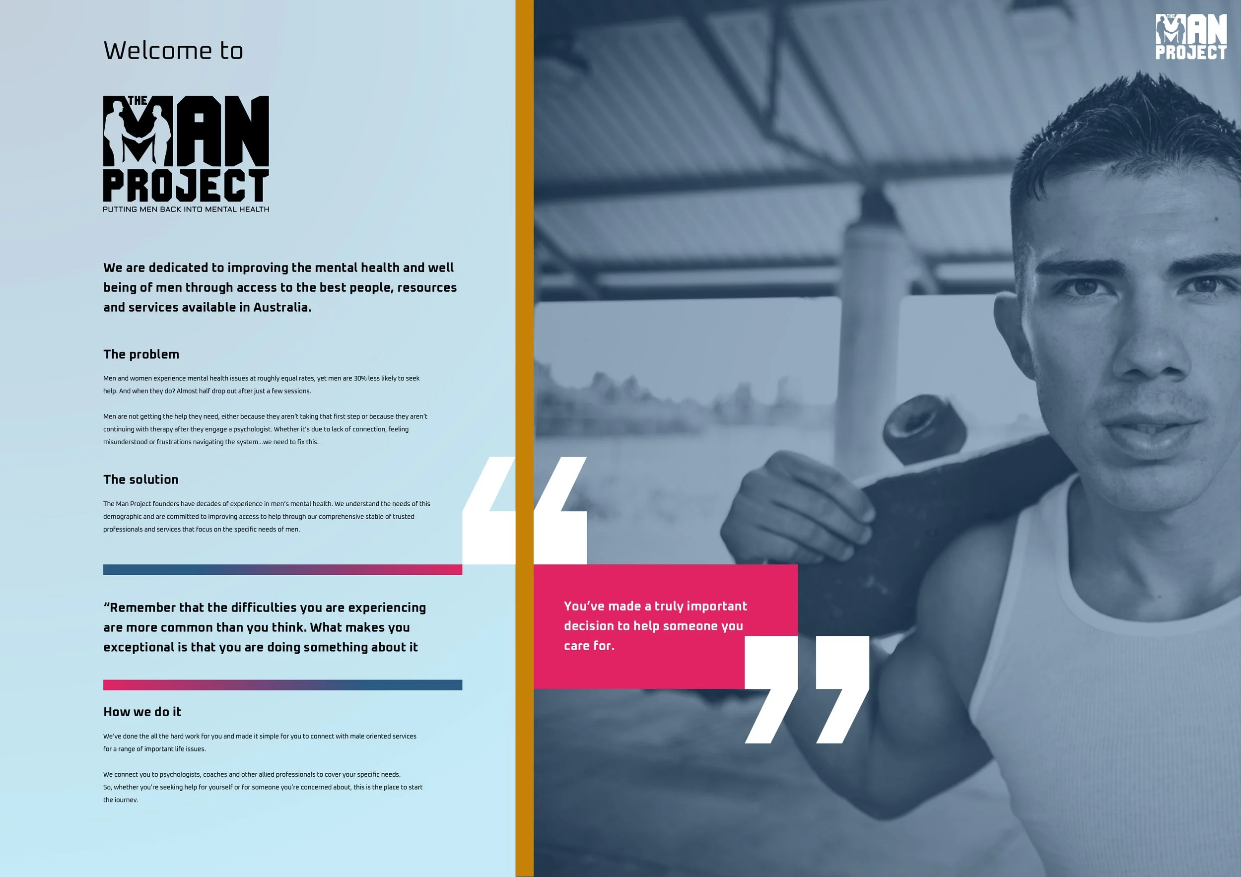
Suggested usage - visualisation
Overall, the logo design for 'The MAN Project' strikes a balance between edgy and approachable, embracing masculinity without falling into clichés.
It captures attention, fosters trust, and promotes recognition and acceptance. The logo effectively communicates the organization's dedication to male mental health, innovative disruption, and inclusivity for men of all ages and backgrounds.
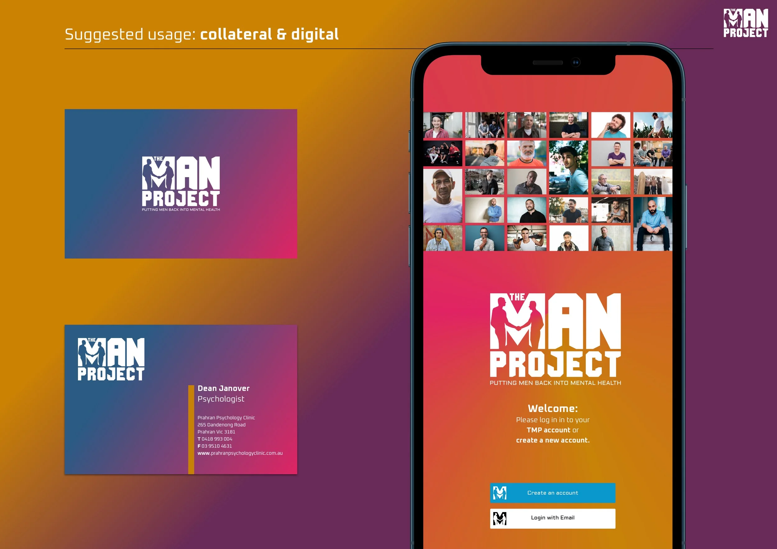
Suggested usage - collateral and digital application
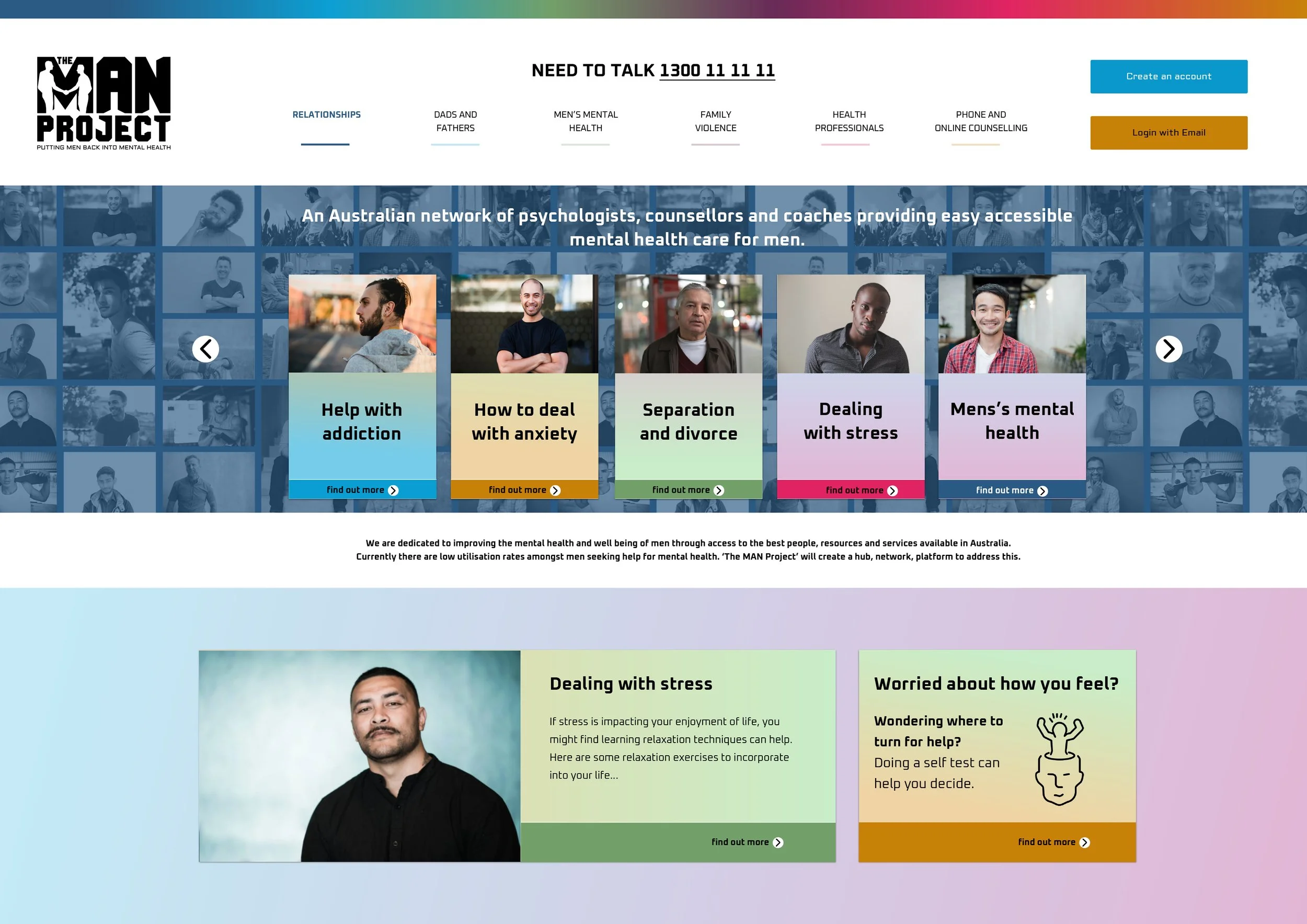
Home page mock - visualisation only
The color palette chosen for the logo is carefully selected to evoke specific emotions and appeal to a diverse male audience. A combination of deep blues, vibrant oranges, and contrasting neutrals is employed to strike a balance between masculinity and positivity. These colors convey a sense of stability, energy, and approachability, ensuring that the logo resonates with men from various backgrounds.