

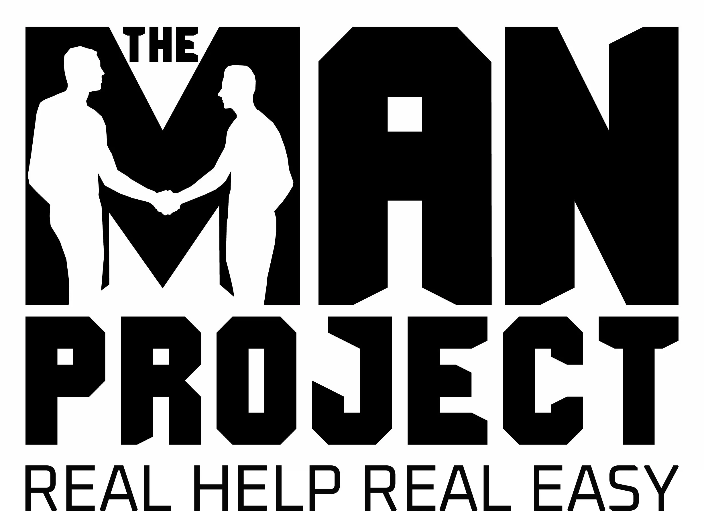
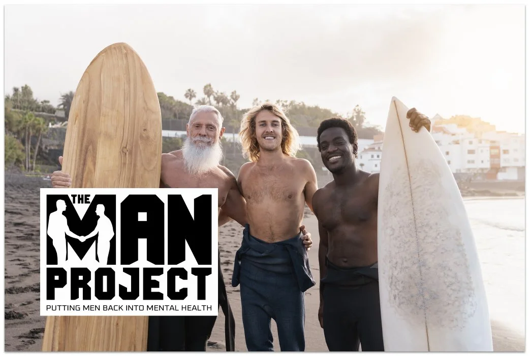
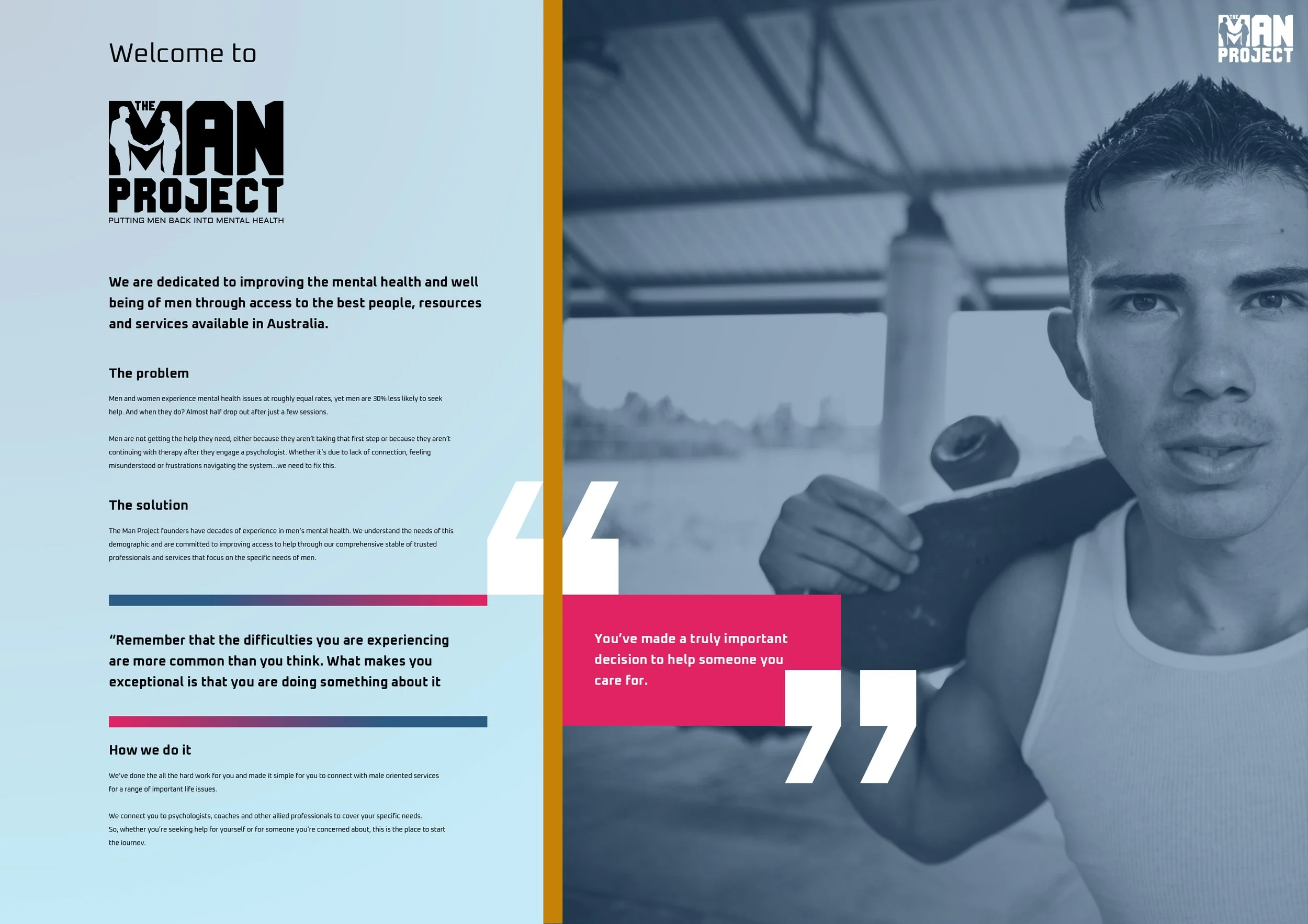
The logo for 'The MAN Project' has been carefully crafted to be highly visual, easily recognizable, and carry substantial visual weight.
It is designed with simplicity in mind, allowing clients to recall it even after a quick glance.

Icon
(i) positive version
The logo design incorporates a symbolic icon that embodies the spirit of 'The MAN Project.' This icon is clean and minimalistic, representing unity, support, and progress.
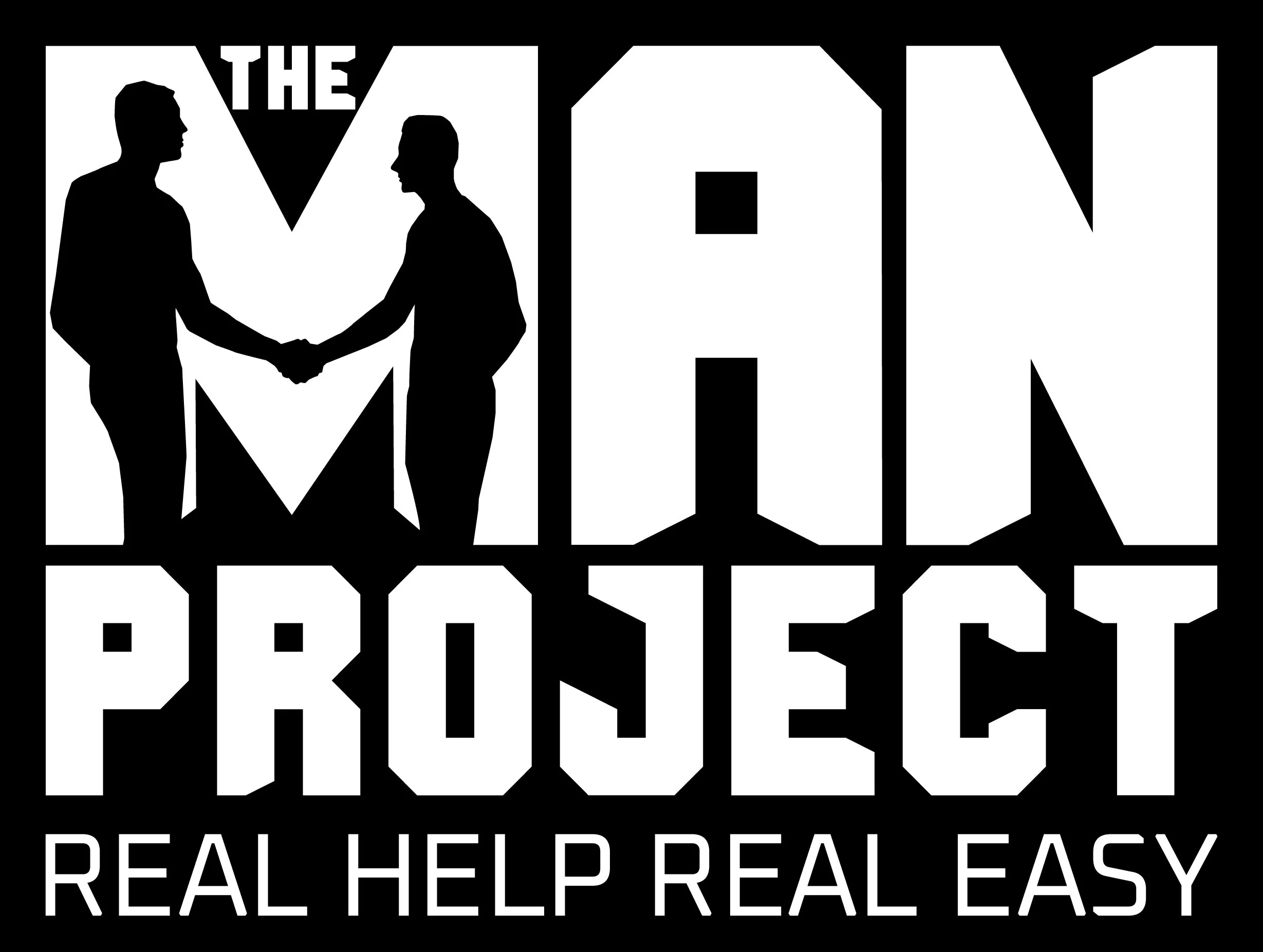
Icon
(i) negative version
Negative version on simple background

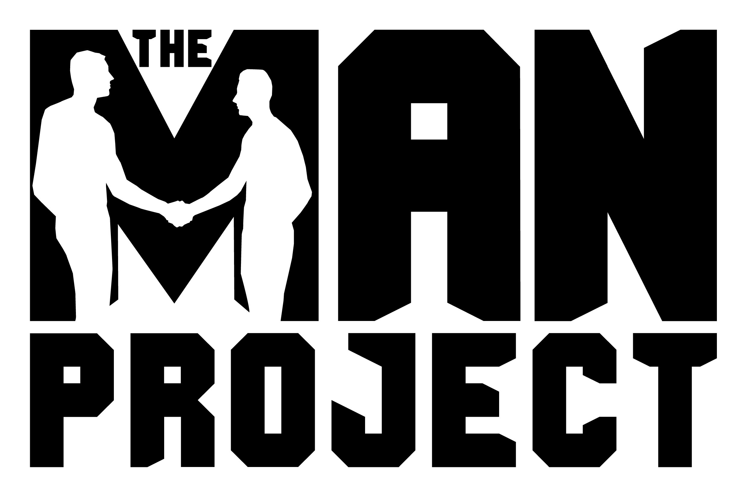
Positive version on simple background

Negative version on simple background
Positive version on simple background
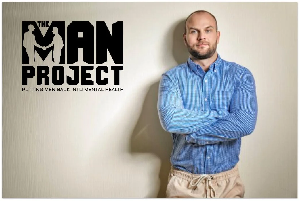
Suggested usage - visualisation
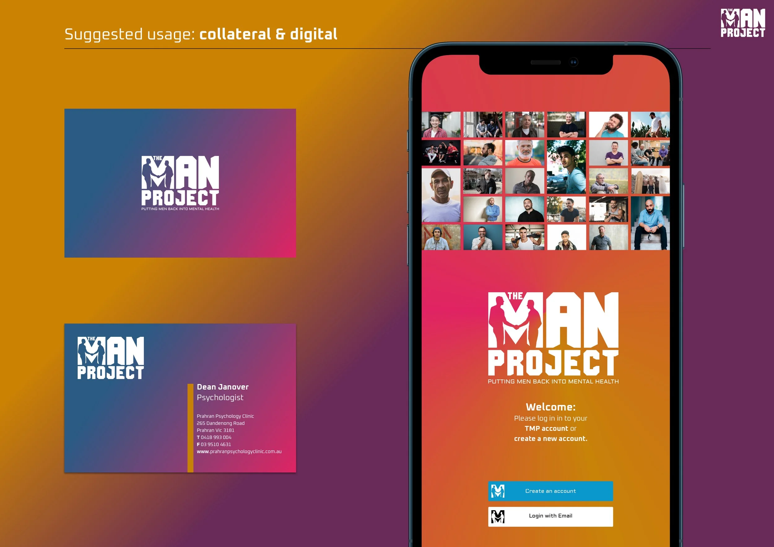
Suggested usage - collateral and digital application
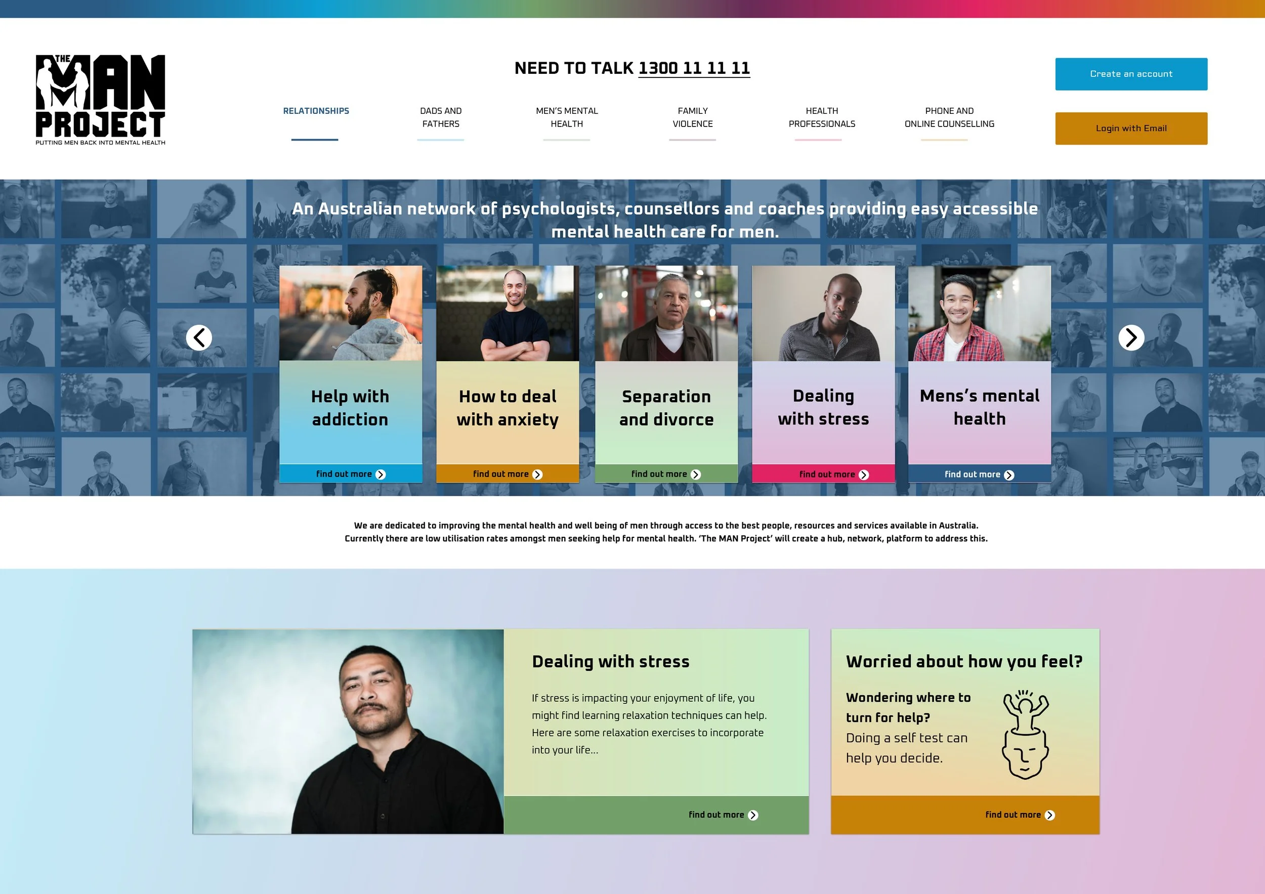
Home page mock - visualisation only
The color palette chosen for the logo is carefully selected to evoke specific emotions and appeal to a diverse male audience. A combination of deep blues, vibrant oranges, and contrasting neutrals is employed to strike a balance between masculinity and positivity. These colors convey a sense of stability, energy, and approachability, ensuring that the logo resonates with men from various backgrounds.